
レスポンシブなテーブル
ども、タカミチです。
仕事でHTMLでのテーブル作成を行っていたのですが
HPがレスポンシブデザインなので、列数の多い表だと
つぶれてしまう・・・
あー
指定のポイントでレイアウトを変化できないかと
ググってみることに
ありましたよー
参考サイト
http://lab.informarc.co.jp/javascript/reflow_table_for_responsive_web_design.html
とりあえず、いろんなわからない単語はググって解決していき、できました。
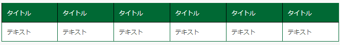
こんなんが
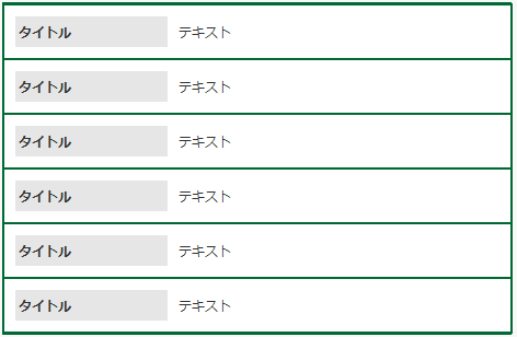
こんなんになります。
ある程度javascriptとcssの理解が必要でした。
一応参考にしたcssとjavascriptのサンプルコードです。まあ参考サイトさんをみればありますが・・・
cssに関しては、少しHPにあわせて変更しましたが、javascriptの方は、ほぼいじらずにいけました。
.simple {
width: 100%;
}
.simple th,
.simple td {
padding: 10px 12px;
border-bottom: 1px solid #ccc;
}
.reflow .label {
display: none;
}@media screen and (max-width: 480px) {
/* 本来のヘッダーを非表示 */
.reflow thead { display: none; }/* セルを横幅100%に拡大 */
.reflow th,
.reflow td { float: left; clear: left; padding: 0; width: 100%; border-width: 0 0 1px; text-align: left !important; }
/* tr毎の境界を明確に */
.reflow tr > td:first-child { margin-top: 20px; border-top: 2px solid #000; }
.reflow tr > td:last-child { border-bottom: 2px solid #000; }
.reflow tr:first-child > td:first-child { margin-top: 0; }
/* ラベルを左右に配置 */
.reflow .label,
.reflow .content { padding: 5px 3px; }
.reflow .label { display: block; float: left; width: 30%; background: #e6e6e6; }
.reflow .content { margin: 0 0 0 33%; background: #fff; }
}
// JavaScript
$(function() {
$.fn.reflowTable = function( options ) {
options = $.extend({
callback: function() {}
}, options );
return this.each(function() {
var $self = $(this),
trs = $self.find( ‘tbody tr’ ),
ths = $self.find( ‘thead th’ ),
labels = [];
ths.each(function( i ) {
labels[i] = $(this).text();
});
trs.each(function() {
$(this).children().each(function( i ) {
var _$self = $(this);
_$self.wrapInner( ‘
‘ );
_$self.prepend( ‘‘ + labels[i] + ‘‘ );
});
});
options.callback();
});
};
$(function() {
$( ‘table.reflow’ ).reflowTable();
});
})( jQuery );